The Cluster Stats screen under the Live Monitor menu displays real-time information specific to each cluster configured in ScaleArc. Graphical representations show Client/Server Connections, Cache Usage, Queries/Second, Cache Hit Rate, and Queries Count per Server, Cache Usage per Database, and Logging. You can toggle on/off the legend corresponding to a specific data type on the graph to isolate behavior.
The bottom section of the screen shows current logs with information collected in the last hour.
Follow these steps to load the Cluster Stats screen and interpret cluster health:
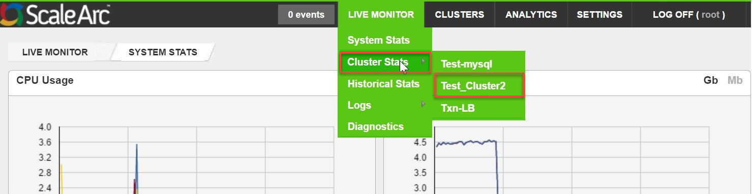
- Click the LIVE MONITOR tab > Cluster Stats > [cluster name] on the ScaleArc dashboard.
-
Review the cluster health on the screen.
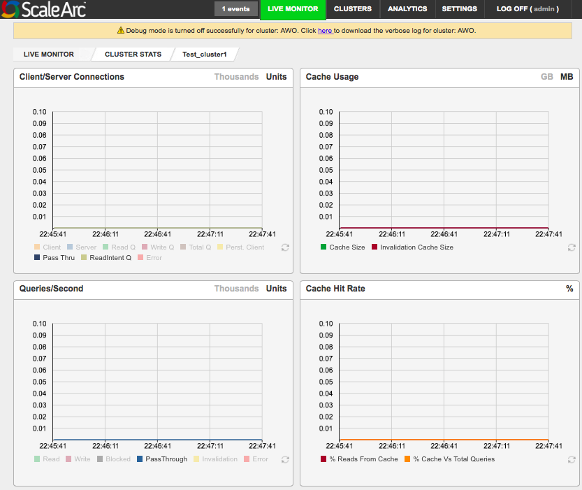
Refer to this table for interpretation of the above graphs.
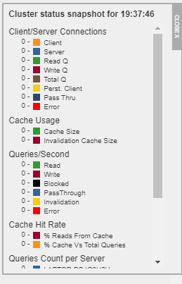
Graph Description Legend Default/User input Client/Server Connections Shows the number of network connections of different types on the cluster.
- Client
- Server
- Read Q
- Write Q
- Persistent client
- Pass-Thru
- Error
1 Click on Thousands or Units in the top-right corner. 2 Toggle the legend to show or hide a selected data type from the graph. Cache Usage Shows the real-time in-memory cache usage (in MBs or GBs) on the cluster.
Cache size; Invalidation cache size 1 Click on GB or MB in the top-right corner to choose the units for the graph. 2 Toggle the legend to show or hide a selected data type from the graph. Queries/Seconds Shows the real-time throughput of queries in the clusters based on the different query types.
- Read
- Write
- Blocked
- PassThrough
- Invalidation
- Error
1 Click on Thousands or Units in the top-right corner. 2 Toggle the legend to show or hide a selected data type from the graph. Cache Hit Rate Shows the percentage of queries that were returned from the DB ScaleArc cache of the cluster.
% Reads from Cache: Of all the Reads, the number that got served from cache
%Cache vs Total Queries: The % number of queries from the total that got served from cache.- % Reads from Cache
- % Cache vs Total Queries
Toggle the legend to show or hide a selected data type from the graph. Query Count/Server Shows the real-time count of queries for each database server configured on the cluster.
Server hostnames/IP addresses in clusters; cache Toggle the legend to show or hide a selected data type from the graph. Cache Usage/Database Shows the real-time size of the cache used on iDB, per database server configured on the cluster.
All logical database names in clusters. 1 Click on GB or MB in the top-right corner to choose the bandwidth type. 2 Toggle the legend to show or hide a selected data type from the graph. Average Response Time per Server * Graph plots the average of TTFB (Time To First Byte) of response across all queries processed in that second. TTFB metric approximates the time taken for the query to process on the server. This value is directly consumed by ScaleArc's dynamic load-balancing logic to determine the load on a particular server and change the traffic distribution among servers.
Server hostnames/IP addresses in clusters. Toggle the legend to show or hide a selected data type from the graph. Replication Lag per Server Graph plots the per second replication lag value calculated by the replication lag monitor (if configured).
This value is directly consumed by ScaleArc's dynamic load-balancing logic to determine the load on a particular server and change the traffic distribution among servers. (You can configure ScaleArc to exclude these lag time values in the load-balancing calculations.)
Server hostnames/IP addresses in clusters.
Toggle the legend to show or hide a selected data type from the graph. * Note that on a database with low traffic, any slow query will show up as a spike on the Average Response Time, whereas on a database with a large enough volume, a few slow queries will not be able to move the average enough. - Select a date and hour range to get a list of logs for your selected cluster within this time period. Click Apply. You can also click Download Original File to get the data on your local machine.

- Click on a log type tab (for example, Query Log) at the bottom of the screen to see all the related logs for this log type in the panel for the selected time period. The logs for the selected cluster include Query Log, Slow Query Log, Alert Log, Query Error Log, User Failure List (shows current data).
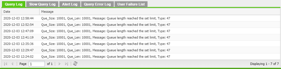
See the Logs section for a detailed explanation of these Log types. - Clicking on any of the graphs will show the Cluster status snapshot for the above metrics at the given time.