
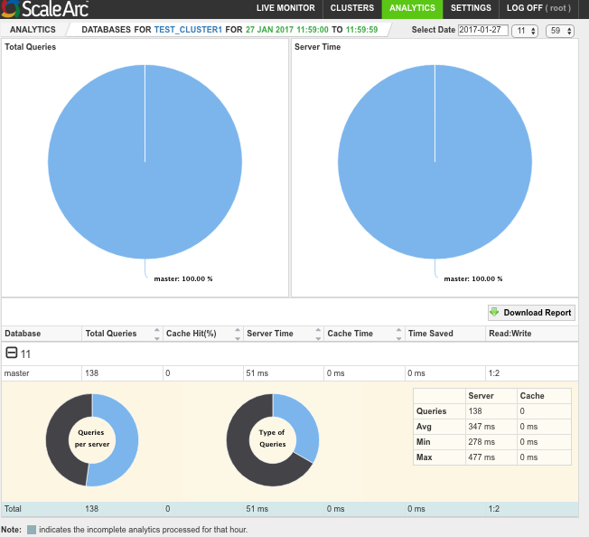
ScaleArc provides pie charts to show the type and percentage of query traffic handled by each database server for the selected time period.
Follow these steps to view analytics reports for database server traffic:
- Click on the ANALYTICS tab then Select the time period.
- Select the cluster and the hour.
- Click on a selected hour (do not click the + sign).
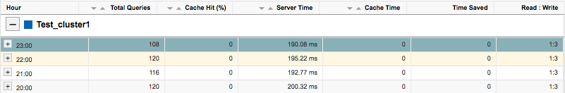
- The first pie chart shows the total number of queries processed by each of the database servers in that cluster for the selected hour. The other pie chart shows the time taken by the server(s) to process the queries for the selected hour. The chart also lists the number of database servers assigned to the cluster. The table below the charts breaks down the total queries, cache hit, server time, cache time, time saved (by ScaleArc), and Read:Write ratio for each server.
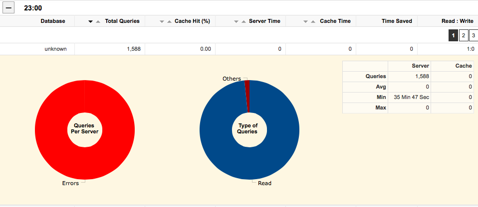
- Hover on a database server to see the breakdown of its query traffic (lower panel). The chart shows a breakdown of which physical servers handled what volume of traffic. The chart on the right provides the type of traffic handled by one of the servers (reads, writes, errors). A summary of traffic showing queries serviced by the server and those serviced by cache appears on the right.
- Hover over another database server to see its breakdown of traffic. This chart shows errors.
- Next, see Query pattern analysis.